In this day and age, creating a logo has become child�s play, literally. A child who knows how to use the Internet and basic software applications can easily find a program or online service and create a logo in minutes! However, it takes some understanding of the basic design principles including fonts, character spacing, color combinations, etc. to create a logo that looks appealing and hits the right note.
The following are some of the most notable examples of poor logo designs that failed on many levels:
1. Bing

Believe it or not, Microsoft Bing was identified as the worst-designed logo of 2009 on the basis of a reader survey by Brand New, an authority blog on branding design. Observing the design closely, it�s not hard to see why it met that fate; the typeface is strange because of bad horizontal scaling and the overall design itself looks pretty dull and unattractive. Clearly, Microsoft didn�t pay attention to these small yet important details before finalizing the logo.
2. Hillary Clinton
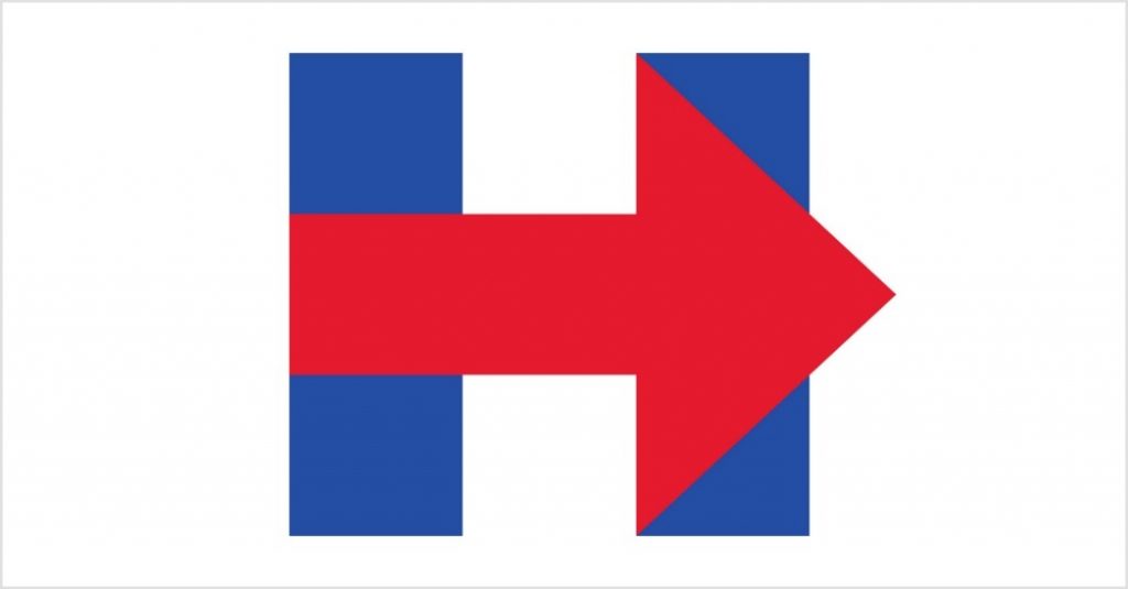
Hillary Clinton was certainly aware that branding is important even in politics which is why she launched her own campaign logo in 2015. However, people were quick to point out the flaws in the design and eventually, her logo became the most disliked presidential logo.
Almost most people had a general idea why the design failed, professional designers shared some concrete details that showed why they were right in thinking so. They gave two main reasons:
- The color of the arrow, i.e. red says �danger� and is also associated with the Republican Party
- The logo focuses on Hillary�s first name although a central theme of her campaign was �gender equality�. Thus, instead of a gender-neutral concept, the usage of her own name which hints at a �female president� was to only backfire
3. Megaflicks
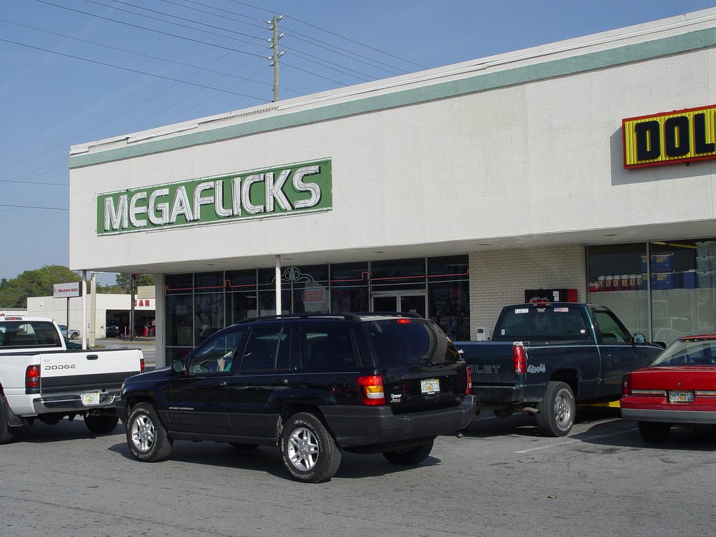
The Megaflicks logo is a perfect example to demonstrate the importance of kerning which is the process of adjusting the spacing between two characters in a font so that the text is easily recognizable and looks pleasant. Clearly, the designer hired by Megaflicks had no idea about the concept. What�s even more surprising is that the glaring mistake that made the logo the perfect material for �memes� was overlooked by the store owner.
4. London Olympics 2012
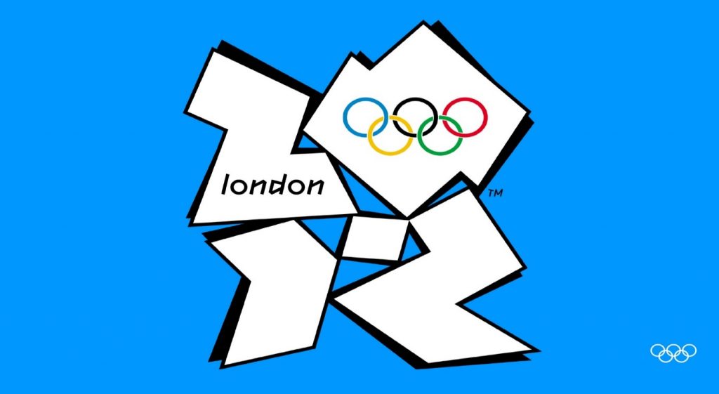
The Olympics are the world�s most important sports events which have a special place in history. However, when London hosted the games in 2012, it created a logo that turned out to be a big disappointment. Some compared it to a poorly designed Swastika, while others saw a small girl using a computer in the image. At any rate, most agreed that the design used irregular shapes that didn�t make sense and fonts that were �childish� and �clumsy�.� In addition to that, it didn�t even try to take inspiration from London�s culture and geography.
5. Gap
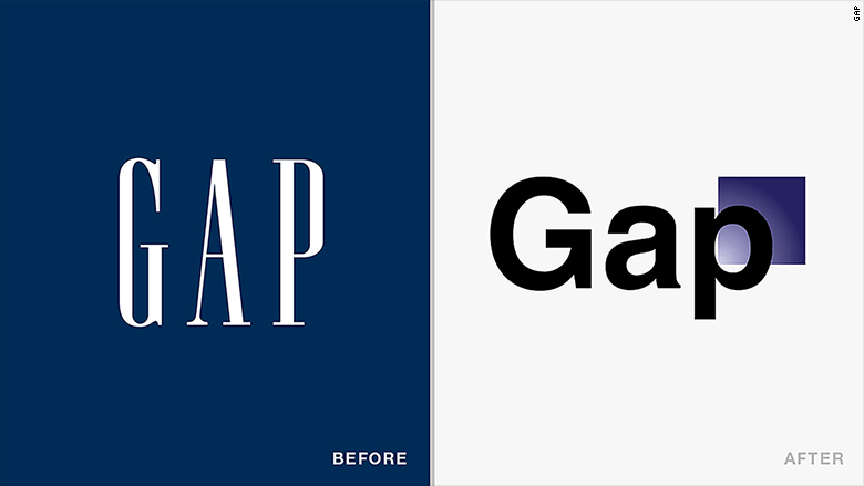
Gap�s original logo was iconic and went to show why a simple and natural logo works well for any business. However, for some reason, it decided to redesign the logo in 2010 only to leave its customers and professional designers across the world dumbfounded. No one was able to wrap their head around a design choice in which bold white letters on blue were replaced by meh black letters on white with a small blue square on the side.
6. University of California
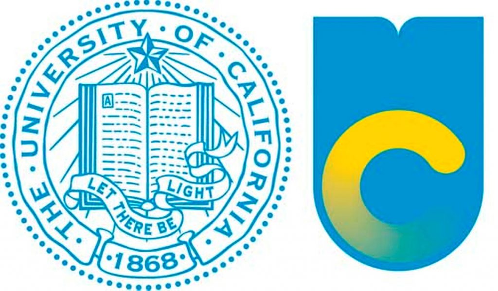
Most universities have prominent logos that bear unique emblems and intricate designs. The University of California had one just like that. It was beautiful, original, and even inspiring with the message �Let there be light�. However, when it decided to redesign the logo to give it a �fresh� look, it ended up destroying the design instead. The new logo was too �basic� and failed to convey the ideologies and prominence of the university. Some people even went as far as to compare the design to a �toilet bowl�. However, the university quickly realized its mistake and scrapped the design.
7. Microsoft
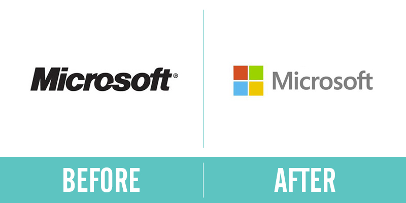
Microsoft�s new logo design is still considered as one of the biggest rebranding failures of all time. The tech giant took a powerful logo and turned it into a generic and unoriginal design, something that baffles the designers even today. The original logo had the perfect typeface, which was both unique and professional. However, the new one is simply bland and shows that you need some creativity even with flat designs that are trending today.
8. Subway
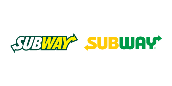
Subway�s tagline is �eat fresh� but looking at their new logo, it seems that the irony is lost on them. Apparently, they tried to �modernize� the design. However, many argue that the older logo looks more modern than the new one. At least the previous logo looked sharper and original. The new one, which makes use of sans serif, majuscule, and a clich�d yellow and green color scheme leaves no room for impact.
9. Verizon
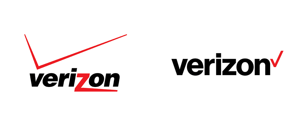
Verizon is one of the biggest telecom companies in the world but its older logo didn�t reflect that. It was poorly designed and looked amateurish. The red check mark which is a symbol of �getting things done� was out of proportion and also put at a bad spot. The stretched �z� didn�t seem to serve any purpose either. However, they fixed these mistakes in the new design that was simpler and thus, powerful. They even found the perfect place for the more �natural looking� check mark.
Author bio:
Tailor Brands is an online platform that offers innovative and advanced branding services including logo designing, brand analytics, business cards designing, etc. It�s one of the few companies to use new-age Artificial Intelligence technology in its products to provide unparalleled results.