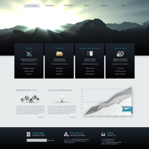
The art of designing is no accident or the result of simply playing with colors. The same applies for the website design process. A clean and informative website could be the distinguishing factor between you and your competitors.

Great websites are those that are attractive to look at and easy to use. They give you enough information but do not overload you with meaningless, boring facts.
Here are a few tips to designing a clean, attractive website that will keep visitors coming back.
- Simplicity is the best policy
�Honesty is the best policy�. Is a statement we have probably all heard. In a similar light, �simplicity is the best policy�, should always be at the fore front when designing a website � whether for clients or otherwise.
Banners, pop-ups, buttons, signs, and the works could leave your visitors feeling cheated and overwhelmed. Excessive use of these would ultimately create a cluttered space and drive viewers away.
Make proper use of flat design and whitespaces. A simple web design layout allows your readers to focus on what�s important.
- The appeal of the color scheme and images
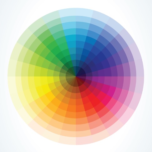
What feeling or emotion are you trying to evoke? Did you know colors can evoke emotions and feelings? The color scheme employed on your website should be easy for readers to digest – they should be easy on the eyes and fit with your websites message. Do you have an area or section on your website that you desperately need to point out? Use the right colors for emphasis. A good idea is to create a color packet (palette) for your website and run with it.

Try leaning towards lighter and neutral colors. Gradients have proven distracting so stay away from those.� Your images should also be consistent.
A clean and informative website should use high quality graphics and images on a beautiful layout. Using software like CorelDRAW to create your graphics is a great way to insure quality in your design.
- Beautiful but non-intrusive typography
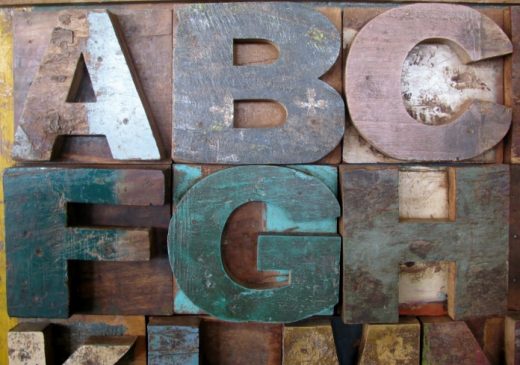
Your choice of fonts is important. Establish what fonts you�ll be using. Three consistent fonts throughout your website should be fine. Adding more fonts could create a messy and unattractive website.

In addition, you don�t need your readers squinting to read – make your fonts big enough. Resist the urge to use flashy and elaborate text, as it can detract from your message. They might be a personal favorite, but they might do your website more harm than good.
- Visual Hierarchy
Virtual hierarchy simply describes the way we view images and patterns. What is our focus? Virtual hierarchy dictates that the eyes move from top to bottom and left to right.
How would this apply to your website? Let�s say you want people to opt-in or click on a particular button. If you�re to use visual hierarchy, you�ll want to position your opt-in or button somewhere at the bottom and top left of your website. Do not overwhelm those visiting your website. Only put valuable information in those ideal areas for maximum exposure.
- Create a Custom Logo
You can either create a custom logo yourself, or have a custom logo made for you. But either way your logo needs to look professional and capture your viewer’s attention.

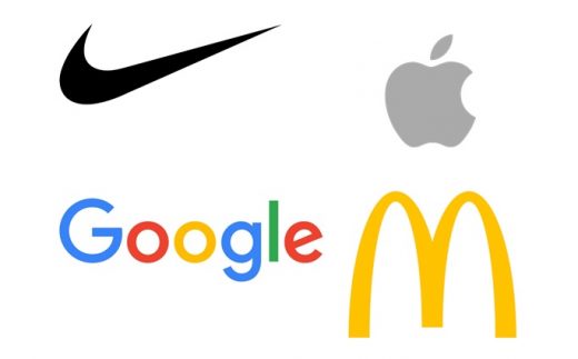
Apple, Google, Nike, and McDonald�s all have logos that capture the eye. They are simple, clean, and people remember them. Use them as examples for your logo design.
Think you�re ready to start your web design process? Give these tips a try and get the ball rolling.